


The global Covid-19 pandemic has made media outlets around the world scrambling in order to produce explanatory stories which help the audiences understand the pandemic, its causes and effects – for example, how the virus spreads and what measures we can all take in order to minimise it. Of course, the journalistic core value of accuracy, along with the journalistic process of verification, are essential here – particularly in the context of journalism’s heightened role of fighting disinformation and misinformation during the pandemic.
One of the most effective methods of informing audiences, especially online and on TV, are high quality data visualisations. Interactive graphics can communicate the story in a way that encourages readers to further explore the data and engage with the story at their own pace, ultimately providing deeper and more meaningful understanding of the problem. However, the sheer volume of available data has proven to be a challenge for media that need to properly select, digest, analyse and in the end present this information to their audiences. Nevertheless, some media outlets are doing it successfully. Here are 5 good examples of online storytelling that combine data, graphics elements and interactivity.
How the virus got out
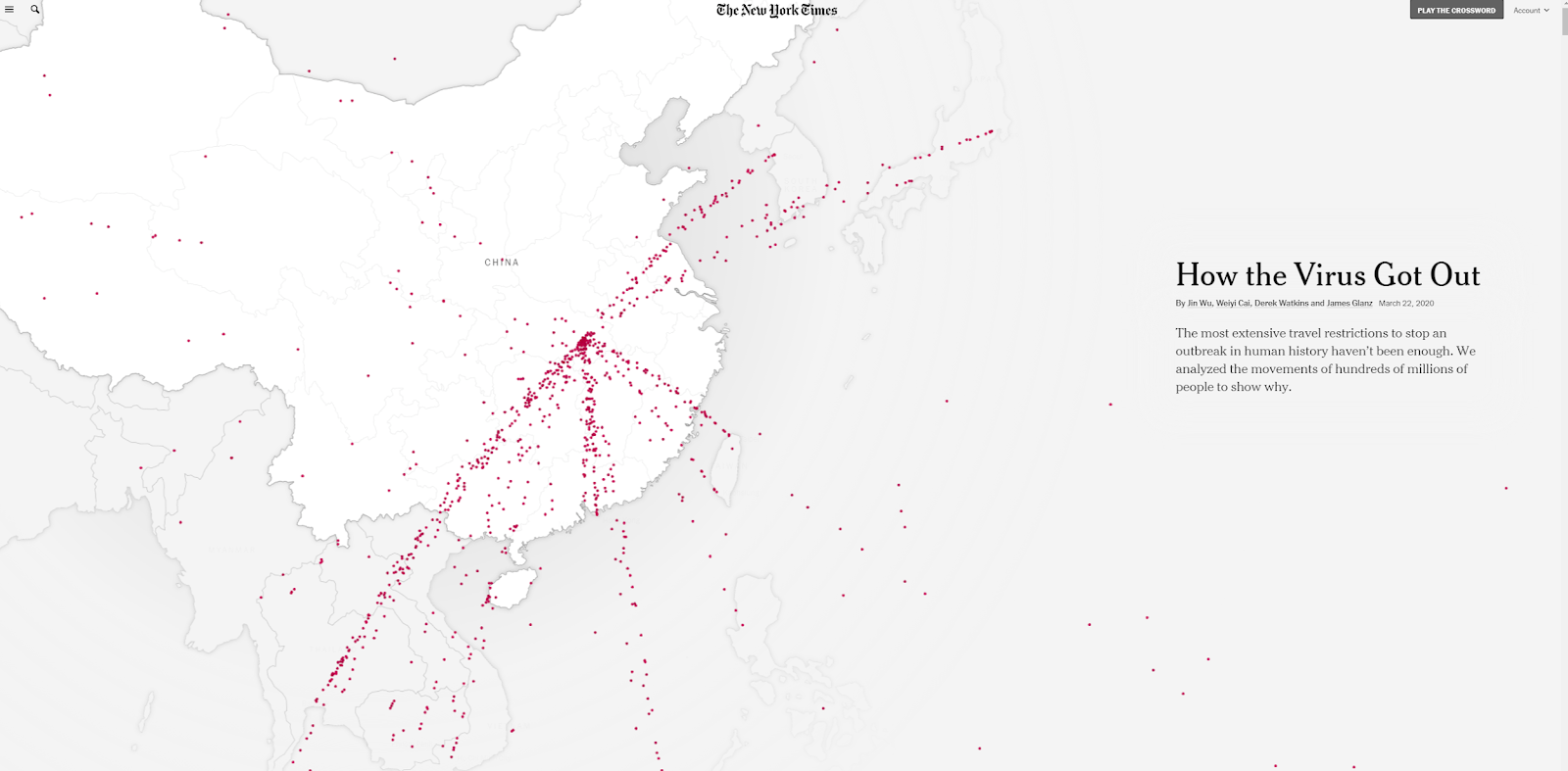
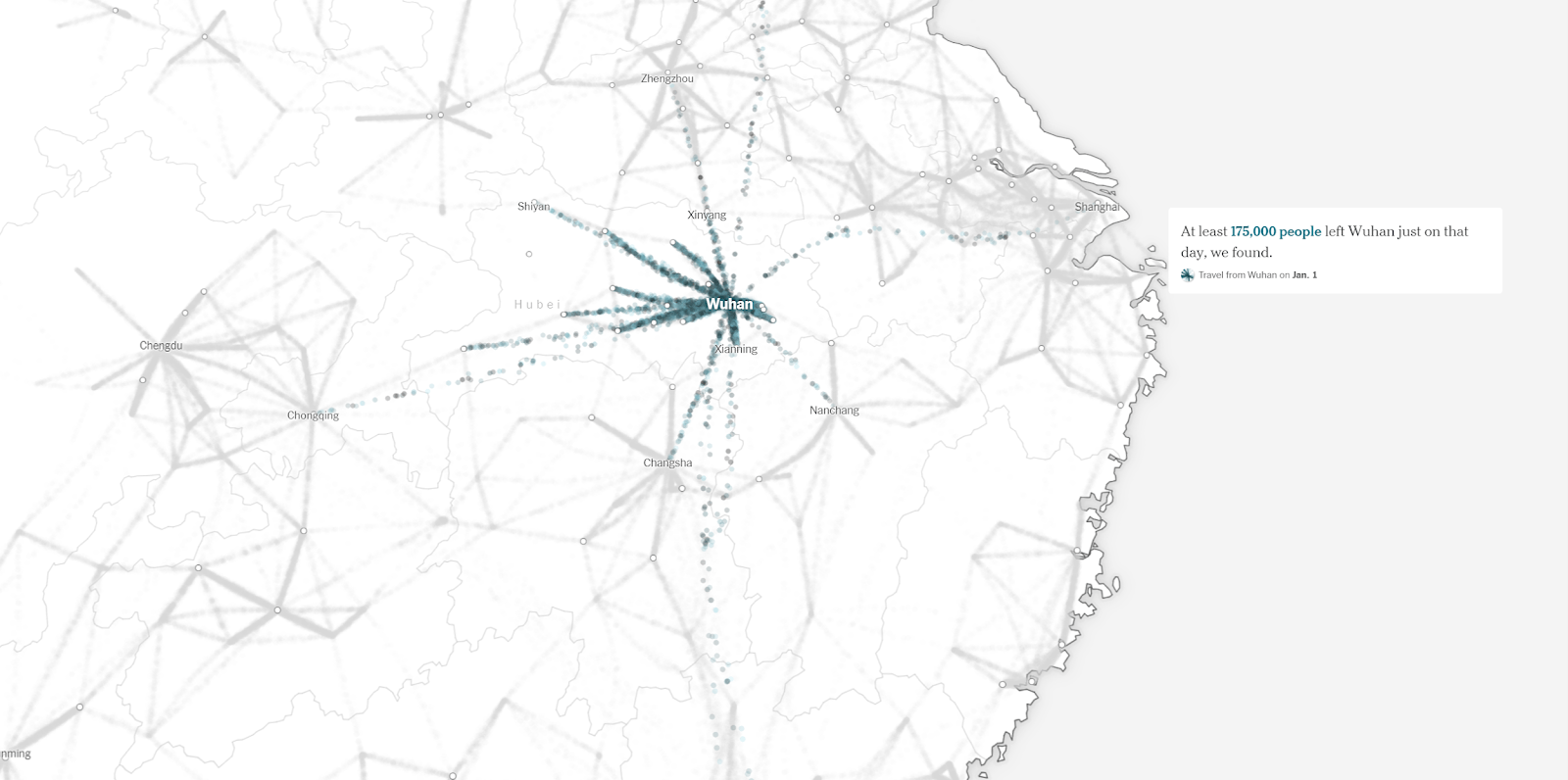


This interactive timeline explains in a visually compelling way how the virus spread from Wuhan market to the rest of the world and caused a global pandemic. Here The New York Times uses maps along with animated graphics that show how the virus spread. There is not a lot of text, but it is strategically very well placed and congruent with the visualisations.
The interactivity is, however, minimal as the reader cannot navigate the maps and is not offered a choice what aspects of the story to follow. Therefore, the story is linear. However, it is designed as an innovative visual journey through a very complex topic which is explained in a very accessible and almost effortless way. In the end the reader is presented with plenty of information, but the way they are structured affords enough time to digest the story and do it at an individual pace.
This is a useful example for other newsrooms - not just in the context of Covid-19 news – because it shows how a complex issue can be picked apart by journalists and presented in a way that is not overwhelming for the audience, but interesting. It reads differently than a regular online article and it keeps the reader interested because of constant changes happening in the visualisations and new information coming in with every scroll.
How the Virus Won
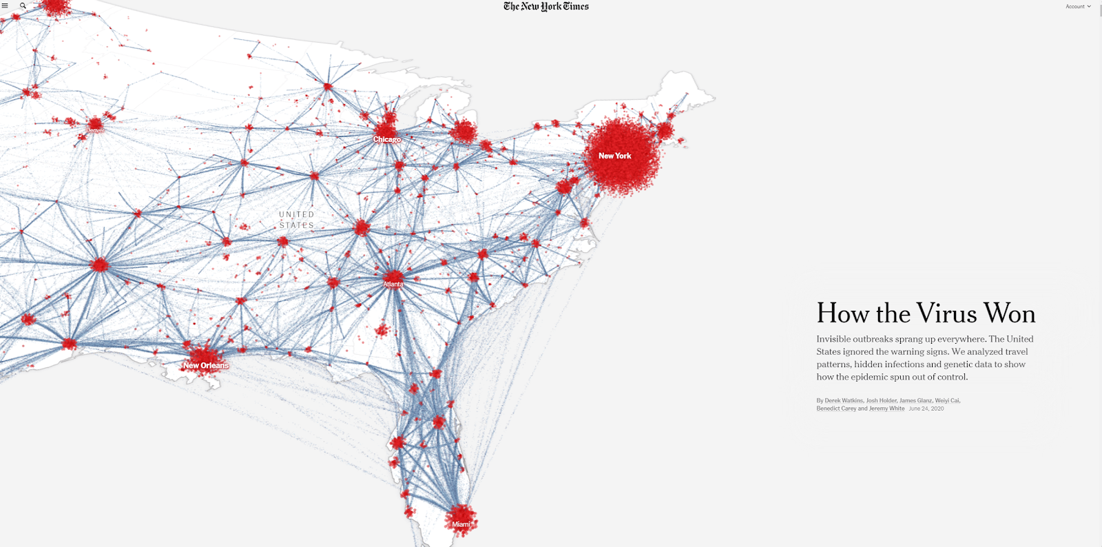

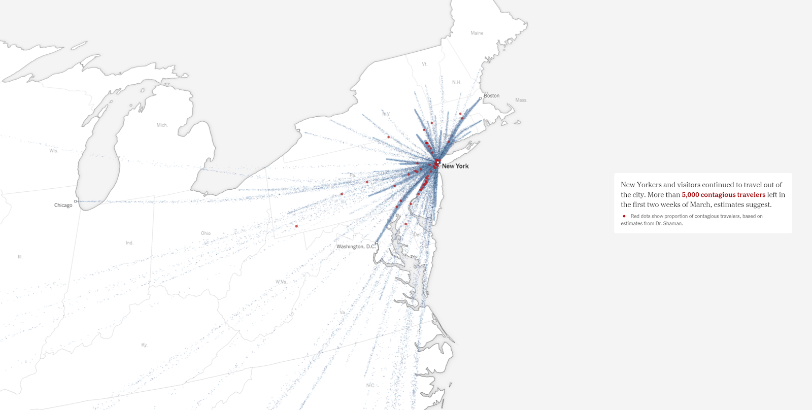
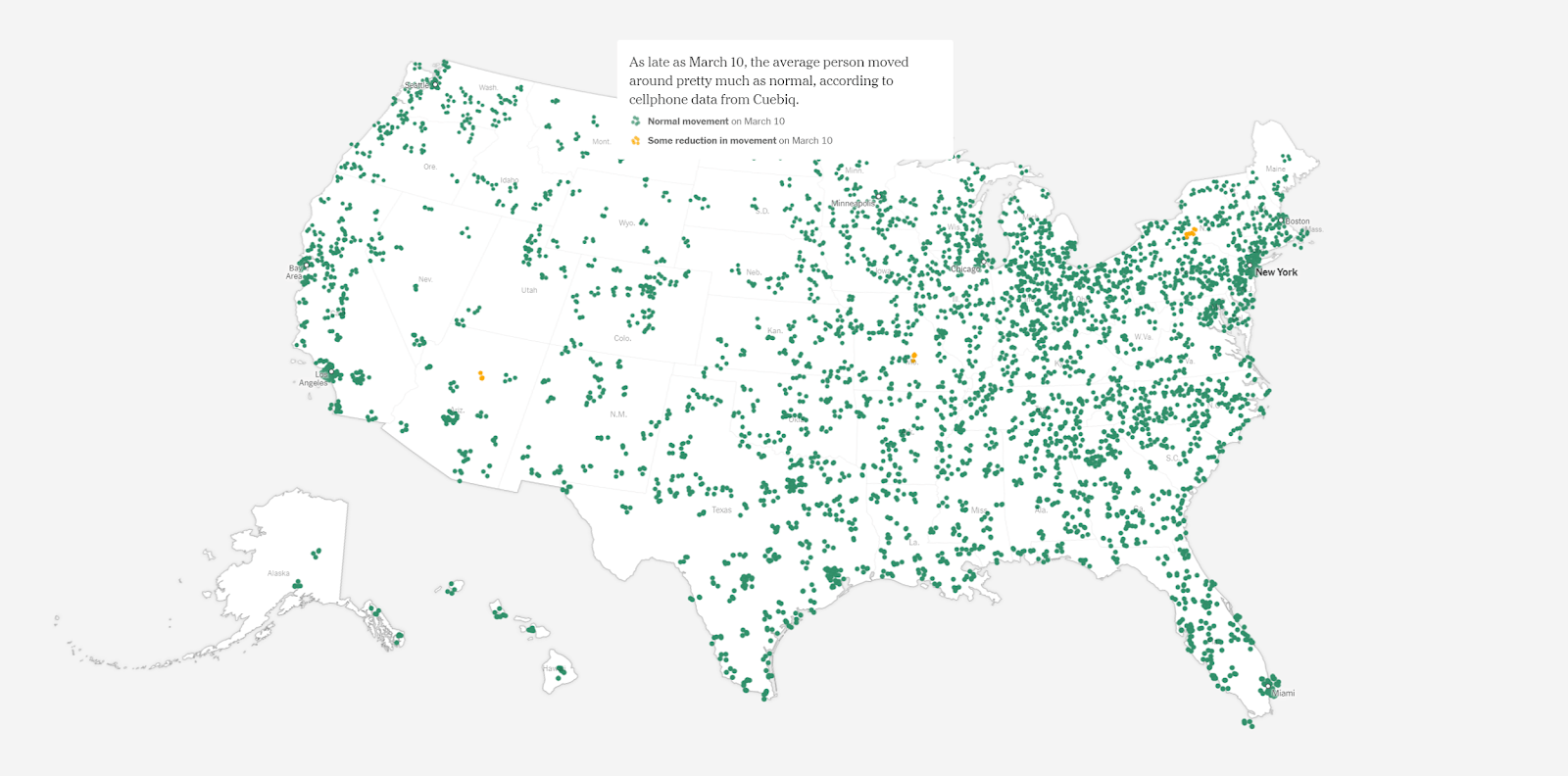
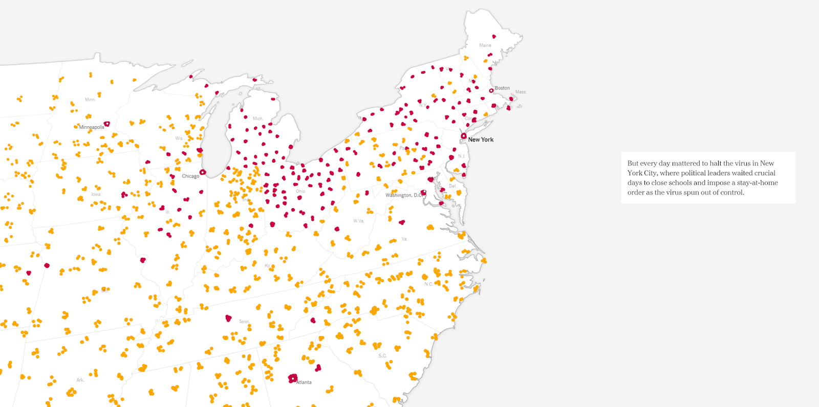

This story uses a similar style of how the data is presented (notice the lines and dots used in this and in the previous example), however here the focus is on the U.S., how the virus travelled through the country and ultimately “spun out of control”. The visual language and style are again creative, yet simple to present how large populations moved and spread the virus.
Notice how text is positioned differently than in the first example and is even more incorporated with the visualisations. Also, the maps here are more animated – notice the little dots to show little and reduced movement across different states. This is a simple, yet effective way of visually presenting it. Also, the use of colour is also indicative and well thought out – check out which colour is used for what aspects of the story.
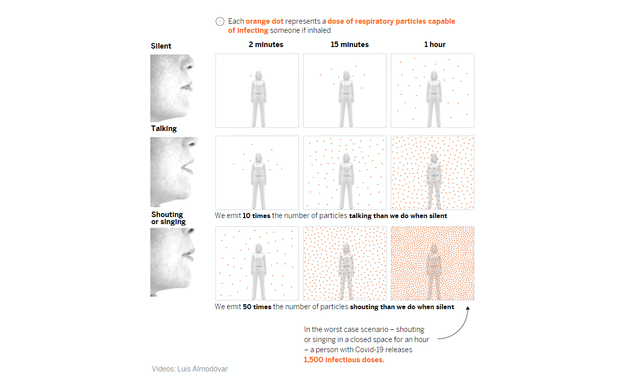
Masks work. Really. We’ll show you how.


This is an interactive visual explainer showing how different types of mask protection help in reducing the spread of the virus. It is also the perfect example of how graphics are sometimes the most suitable way to illustrate certain topics, particularly abstract processes such as this one. It is also visually very simplistic, yet effective – notice how the spread of particles is visualised.
Using minimal text along with animated graphics to highlight important aspects confirms that graphics are sometimes the most effective way to illustrate certain things or abstract processes that are otherwise difficult to explain. While producing this kind of interactive story is a time-consuming task for a team of journalists, producers, graphic designers, and animators, it is still a worthwhile lesson: in visualisation of complex information, more is always less.
A room, a bar and a classroom: how the coronavirus is spread through the air


The findings of a scientific study are simplified and told through interactive visual storytelling. Other media outlets around the world were inspired by this project made by El-Pais and produced their own regional version of the same story. This is again a linear story where scrolling down reveals new information. Perhaps the most interesting aspect of the story is the information itself and the simplicity of how it is visually presented.
At the time when the story was published, it was a very useful source for all citizens who wanted to better understand how the virus is spread in everyday activities and environments. This is an interesting example in terms of data visualisation because it inspires a different way of thinking in explanatory journalism, particularly in terms of simple illustrations that all audience members can easily understand and relate with.
The unvaccinated US teacher who infected 12 students with Covid: Lessons to be learned for the return to school
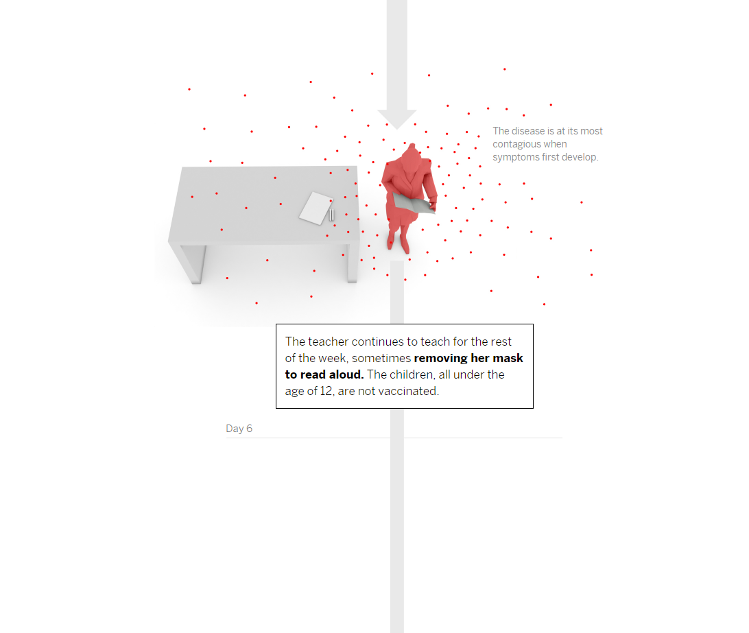


Like in the previous example, El Pais uses the same style but journalistically goes a step further in this story. Here it gives an in-depth overview of a case study how unvaccinated people can infect others, particularly in a classroom. Visually clear and simple, it illustrates the dangers of not following safety protocols and precautions regarding COVID-19.
Perhaps the most interesting aspect is the visual representation of how the virus spread in the classroom – notice the minimalistic way in which the pupils are presented, along with the direction of how the virus spread. Here text is also strategically incorporated in every visualisation. If you have time, read the whole article and notice in what way information is presented – particularly journalists’ efforts to explain what happens in very few words. Finally, the use of two graphs in the story, while simple, were also the ideal choice for presentation of trends.